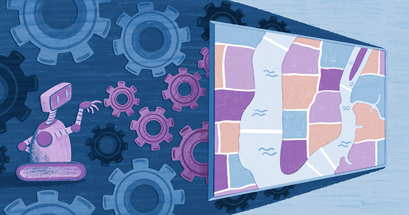
I am Isaac Besora, a software engineer at Felt. This post explains how I solve common issues with map rendering to achieve our vision of an easy-to-use, fun, real-time collaborative mapping tool.
The Basics: Web Mapping Libraries
Most web mapping libraries use a tiled rendering engine that subdivides the screen into a regular grid and renders each grid section or tile. This approach enables rendering and network parallelism, which improves the time it takes to render the entire map by not waiting until a tile data is fetched and rendered.
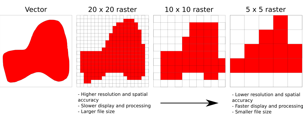
Web mapping libraries can be grouped into raster-based and vector-based renderers, where the first ones are focused on rendering image-based data and the second ones use vector-based data and show more refined details. Some of the most widely used web mapping libraries are MapboxGL JS and its open-source fork MaplibreGL JS, Leaflet, CesiumJS, and Openlayers. With image-based data, the level of detail is dependent on the pixel size of the image. A smaller pixel size will result in more accurate representations of the data at the expense of bigger file sizes and slower processing times. Vector-based data defines its contents in coordinate pairs using points, lines, or polygons instead, more compact for basemap use cases and enabling maps rendered at native device resolution.
At Felt, we are using and actively contributing to Protomaps JS, an open-source map renderer that works on top of Leaflet and enables it to render vector data. Working closely with @bdon, creator of the library, we have implemented some features that individually allow us to render beautiful base maps and data. The decision to use Protomaps JS instead of some other more feature-rich renderers is that we only cater to a subset of the use cases they support, and we don’t need all the complexity associated with it. One of our goals is to render beautiful 2D maps fast, so the 3D functionality of Mapbox GL JS, MapLibreGL JS, and Cesium, for example, only adds more complexity and makes rendering slower for our purpose.
Map renderers' challenges
Overzooming
Overzoom happens when we want to render data at a higher zoom level than the maximum allowed by itself. Let’s say, for example, that we are rendering raster data acquired with a pixel size of 20 meters. At 1:70000 scale, a screen pixel is 19.093 meters, rendering one raster data pixel in one screen pixel. At 1:150000 scale, a screen pixel is roughly 5 meters, meaning that each raster data pixel will be rendered on 4x4 screen pixels producing a blocky image. This problem becomes even more apparent when mixing layers with different resolutions or raster and vector layers.

Styling
For each type of data we can get, we can devise a new way of showing it on a map. Take, for example, wind data. We can create a raster layer showing wind speed per pixel or create a dynamic map. The breadth of options makes having all of them available in a map renderer impossible. One way to deal with that is having a style grammar that allows customizing how data is rendered in a map. The other is to use some data visualization libraries, like deck.gl, that significantly expand the number of different visualizations available.
Even then, there could be times where you want to do something different, and the only option is to rely on the custom layer functionality of some renderers. That’s usually done with WebGL, which involves a more complex language and API and a completely different programming model than Javascript. One of the beauties of Protomaps is that in addition to the already available ones, custom symbolizers, the units of code used to render a layer into the screen, can be written in plain javascript, making the learning curve for custom cartography much gentler than other solutions.
As an example, the following code produces the image shown below:
Simplification, clipping, and science!
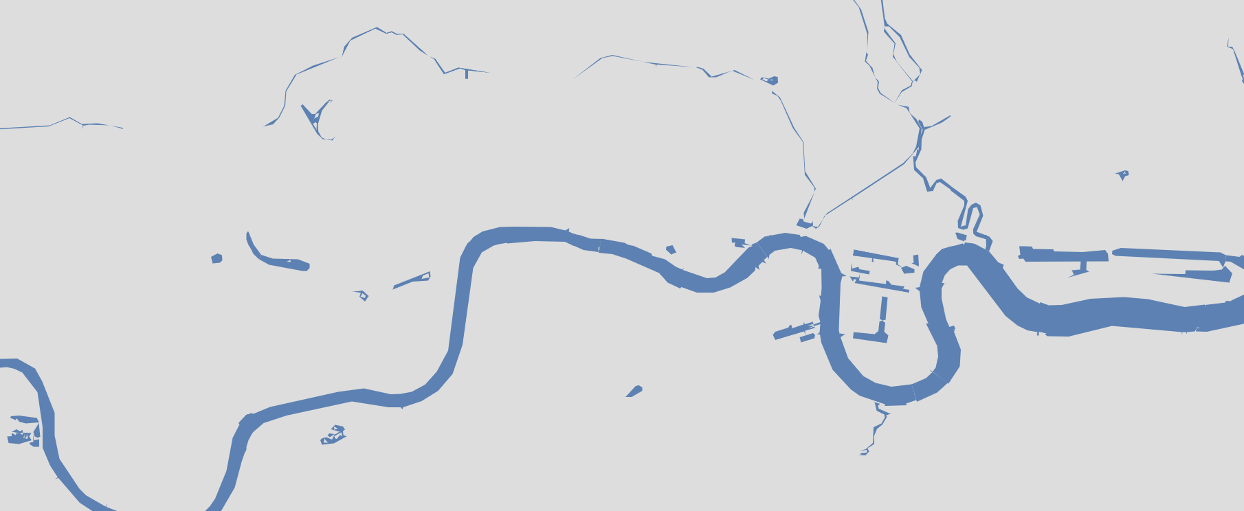
Although vector data resolution should be handled when creating the data, sometimes we need to reduce the complexity of the polygons further to render. To solve a bug in some browsers when polygons have a significant number of vertices, we implemented the Douglas-Peucker algorithm to simplify lines and polygons and the Martinez et al. clipping algorithm to divide them. After comparing both solutions, we found that simplification was the only way to guarantee correct results with features crossing tile boundaries.
We upstreamed our solution to Github, making our improvements available to the broader open source web mapping community.
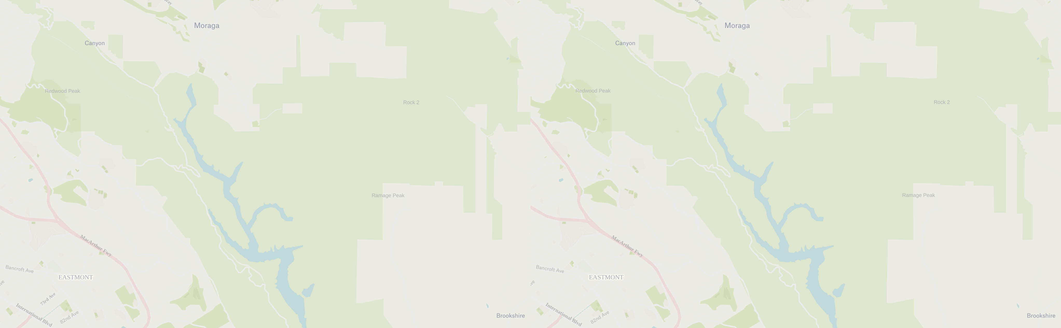
Label collisions
One of the most important aspects of a map is label placement. Dealing with multiple layers of data, you can find many places with overlapping labels. Take, for example, a data layer that contains street names and another one that includes points of interest (POIs). As most POIs are found in streets, rendering all the labels from both layers would result in a mess.

By carefully defining the rules used to draw the labels and using an R-tree to check for collisions, we can avoid overlapping labels, making everything much more readable.

In addition, by trying not only one position per label but multiple ones, we can increase the coverage of labels across the map, making it possible to show labels that wouldn’t have been shown otherwise.
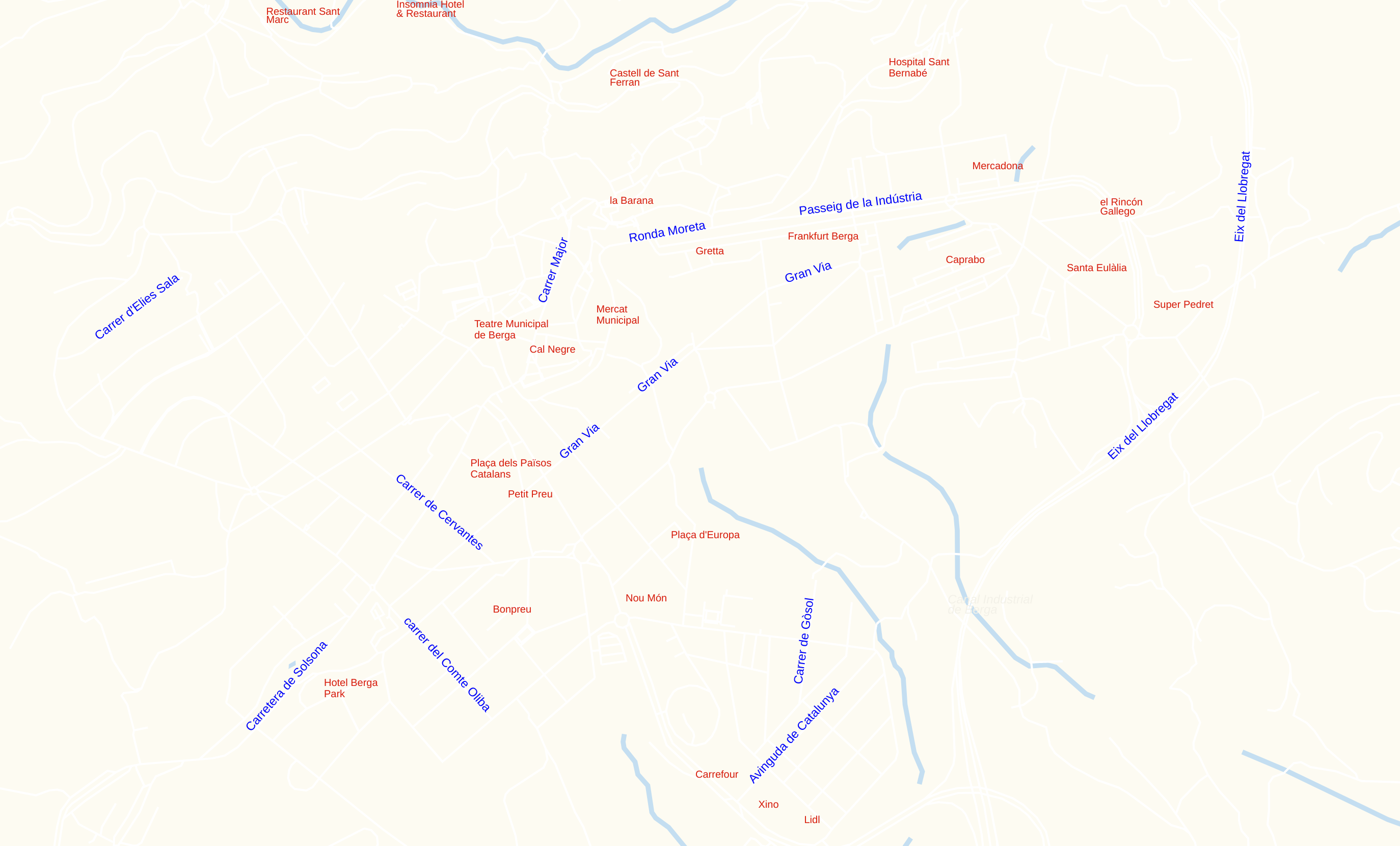
Finally, setting the distance at which a label is repeated can further improve our map legibility.

Performance
Web maps are interactive and visually rich applications, and as such, the rendering performance is crucial at Felt. We want our maps to feel fantastic when interacting with them. There are three main factors involving web maps' performance: how big each tile data is, how long it takes to fetch a tile, and how long it takes to render that data. Our backend engineers work hard to avoid tile size and fetching being a problem. The third one is one of my focuses.
The first thing you need is a baseline to measure against to optimize performance. To do that, we added some events to Protomaps that are dispatched once rendering starts and ends, removing the influence of network traffic and decoding time from our measurements.
Once we had that baseline, we started working on some basic computer graphics optimizations: Reducing state changes and batching draw calls together. Reducing both cut our base map rendering time by 20% and our data rendering time by 55% on average.

If these kinds of problems sound interesting to you and you want to help create the best place to create maps on the Internet, come and join us!