By the time Mudassir Azeemi wrote to Apple CEO Tim Cook in 2014, he’d tried everything he could think of to make it easier to type in his native language, Urdu. In 2010, the now 42-year-old Pakistani-American developed a keyboard app you could use on iOS devices; within two years, it had been downloaded over 165,000 times. But even with an Urdu-language keyboard, the characters appeared on the screen in an entirely different font.
“Dear Mr Tim Cook,” he wrote. “Urdu language’s beauty lies in the typeface.”
Spoken by nearly 170 million people in South Asia and the South Asian diaspora, Urdu is written in an alphabet derived from Arabic. But while Arabic is written in a script called naskh, simpler and more linear in its appearance, many other people — including Iranians, Afghans, Pakistanis, Urdu-speakers in India, and Uighur-speakers in parts of China — employ an ornate style of writing that originated in 14th-century Persia called nastaʿlīq. When Azeemi sat down to write his letter to Cook, nastaʿlīq was almost nowhere to be found online. To communicate in Urdu, you either had to type in naskh or spell words phonetically in Latin script.
Azeemi, a software developer now working and living in Silicon Valley, grew up in Pakistan’s sprawling seaside city, Karachi. As a teenager during the days of dial-up, he once racked up an internet bill that cost half of his father’s monthly salary; in his early 20s, he learned to code on one of those old calculator-sized computers called palmtops. He didn’t give much thought to Urdu’s digital future until he moved to California and became a father. Watching his children learn English through songs on YouTube, he’d felt a pang of loss — the anxiety that they might never speak or appreciate Urdu the way he does. One of the earliest apps Azeemi developed, even before the keyboard, was for nursery rhymes in Urdu.
These early attempts at yanking Urdu on to the internet hadn’t been particularly profitable — Azeemi says he lost over $50,000 in the process. He remained determined. In 2013, Apple introduced an Urdu keyboard for iOS devices, but, much to the chagrin of Urdu users, the default font was still naskh, the Arabic font. In Azeemi’s eyes, the solution was now pretty straightforward: operating systems — Apple, Google, Microsoft, and others — had to be persuaded to adopt nastaʿlīq.
His open letter, addressed to Cook and Apple’s chief design officer at the time, Jonathan Ive, described the need for a nastaʿlīq font on iOS platforms. “The only hurdle for us is to bring the typeface that truly represent[s] the language,” wrote Azeemi. “And every language, when it is written, shines when using the typeface which it truly presented in the world.”
When Urdu calligraphers speak of nastaʿlīq, it is with deep reverence. In the subcontinent, it was the script that disseminated the Quran, considered the word of God. Mir Ali of Tabriz, a 14th-century Persian calligrapher known as the father of the script, is said to have developed it after a dream in which Ali, son-in-law of the Prophet Muhammad, instructed him to draw letters that looked like “the wings of flying geese.” Squint at an Urdu verse in nastaʿlīq, and it might very well begin to resemble a flock of birds taking flight, or a branch in bloom. Nastaʿlīq characters, per one observation, appear to “swing from the upper right to the lower left of each word as if suspended by an imaginary line.”
In some ways, this emphasis on the form of writing a language runs contrary to conventional wisdom. We tend to think of text as a means to an end, that the characters depicted are there only to convey meaning. If you could write the same Urdu word in the Arabic naskh script, even if it looked a little different — naskh is smaller, simpler, and sans serif — wasn’t the demand for digitized nastaʿlīq just a minor typographical quibble?
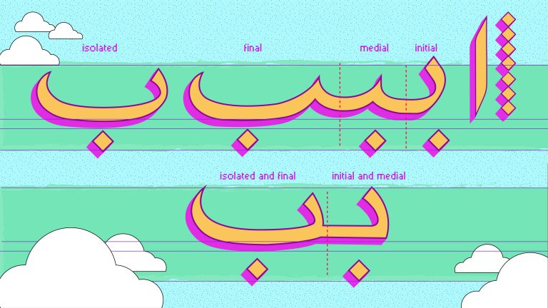
Nastaʿlīq, after all, is a nightmare to code. It moves right to left, like all Arabic scripts, but also slopes downward: the longer the word, the steeper the slope. The shape of each letter changes, depending on the letter that comes before and after; in a 39-letter alphabet, there are thousands of permutations. Its multifaceted nature is precisely why coders haven’t developed nastaʿlīq fonts as easily as, say, Cyrillic.
We tend to think of text as a means to an end, that the characters depicted are there only to convey meaning.
It didn’t have to be this way. As early as 1951, just four years after wresting off British rule, Pakistan — where Urdu is both the official language and played a key role in the movement for independence — set up a national printing press that could compose in both English and Urdu, a substantial investment for the young, cash-strapped country and an indication, perhaps, of Urdu’s importance for its nation-building project. But even though Monotype and Linotype, the predominant printing technology firms of the time, kept developing typefaces for the Urdu market, local publishers kept rejecting them because they just didn’t match up to the local nastaʿlīq aesthetic.
Part of the reason nastaʿlīq ran into trouble was because the technology at the time — specifically the typewriter — was built with English in mind. Subsequently, as historian Thomas S. Mullaney notes in his book, “The Chinese Typewriter,” all other languages are seen as permutations from that norm. Hebrew is English but backward. Arabic is English backward and in cursive. Russian: English with different letters. Siamese: English with too many letters. Perhaps the only major language to escape the thumb of Latin hegemony was Chinese, a script that is neither alphabetic nor syllabic, and thus had to be imagined entirely outside the box of existing technology. But nastaʿlīq, presumably not quite significant enough to send typographers back to the drawing board, remained stalled until the 1970s, its mechanical rendering nowhere close to the sweep and flourish of the handwritten script.
In modern-day Iran, where nastaʿlīq originated, the font changed to meet the limitations of the existing technology. Over the years, Farsi slowly developed a typographical identity that worked within the constraints of the block printing press but was stylistically different enough from the Arabic naskh to feel sufficiently “Persian.” If you pick up a newspaper in Tehran today, it looks significantly different from a paper in Karachi.
Why didn’t Urdu, and Pakistan, go down a similar typographical route as Farsi did in Iran? Stubborn fidelity to nastaʿlīq aside, one reason may be the ways in which Urdu differed from other nastaʿlīq-favoring languages. One letter, “the baṛī ye (ے), is particularly influential on the look of written Urdu,” writes typographer and historian Titus Nemeth in “Arabic Type-Making in the Machine Age” (2017), “and its typographic rendering is among the most challenging design questions in an Arabic font.”
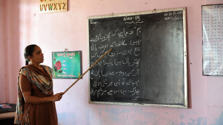
The baṛī ye, which resembles a bent elbow, produces all sorts of mechanical obstacles with regard to kerning and the placement of dots and diacritics. Baṛī ye and letters like it posed a problem that seemed so insurmountable, in fact, that, in the 1960s — mimicking Mustafa Kemal Atatürk’s mission to convert Turkish script into a Latin alphabet — Pakistan’s military ruler Ayub Khan proposed officially writing Urdu in Latin letters. He was met with near-instant pushback: the nastaʿlīq script, protested local religious leaders, was an essential marker of Pakistan’s Islamic identity. Without meaningful progress in the printing process, Urdu publications in Pakistan, including dailies, continued to be written by hand well into the 1980s, armies of calligraphers scribbling furiously day and night.
Ahmed Mirza Jamil, owner of a printing business in Karachi, inherited his love for nastaʿlīq from his father, who, in his later life, took up the daunting task of writing the Quran in his own hand. He’d completed only a third of the holy book before he fell ill and died, but his sons vowed to finish his cherished project. They photographed their father’s nine handwritten chapters, then cut and pasted his letter formations to piece together — like a jigsaw puzzle — the remaining two-thirds of the Quran. It was a staggeringly elaborate labor of love that took 14 years to complete. And it sowed the seeds for a long-awaited breakthrough in Urdu typesetting.
In 1980, Mirza Jamil wrote out every combination of Urdu letters that he could think of — roughly 20,000 by most accounts. These combinations, known as ligatures, became the basis of a new Urdu typeface: Noori Nastaliq, a font Jamil named after his father. It solved the difficulty posed by the shape-shifting nature of nastaʿlīq: instead of representing letters, it represented entire combinations of letters written together. The 20,000 ligatures were by no means exhaustive, but the chances of any other combination cropping up, Mirza Jamil reckoned, were negligible. He’d been inspired to address Urdu typographical troubles after encountering a Chinese keyboard, a 48-inch contraption with up to 500 characters, on a trip to Singapore.
“I thought, if the Chinese could do it,” he told a journalist in 1996, “so could we.”
With the advent of Noori Nastaliq, Mirza Jamil was hailed as Pakistan’s Gutenburg and bestowed with state honors. Urdu’s path to progress, one writer wrote, “will be lit with the candle of Noori Nastaliq.” Still, adoption was tentative: for a while, according to the historian Nemeth, the country’s largest national newspaper, Daily Jang, carried typographically composed text alongside columns that were still handwritten, hoping to convince the nastaʿlīq purists that their beloved font could be printed too.
For decades, Noori Nastaliq remained the dominant typeface in Urdu publishing; a digitized version of it continues to be used today. But it is very much a product of its time: certain letter combinations don’t show up if you type them, glyphs jostle one another, clumps of misplaced nuqtas mar the text. For a generation now accustomed to sleek interfaces, the effect is off-putting.
Nasrullah Mehr, a veteran calligrapher based in Lahore, explained the downsides of a ligature-based approach to typesetting. “You can do 42 thousand ligatures, you can do a hundred thousand, you can do one million — it won’t end,” he said, shaking his head emphatically. “Words from other languages crop up, new words come up; you cannot remain true to a language this way.”
“To be a good calligrapher, you have to be a very good artist. And you also have to be a good person.”
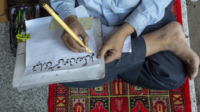
Nasrullah has a wide, white beard he keeps tucked inside his Covid-19 mask these days; it’s one measure of how long he’s been in the calligraphy business. He taught himself nastaʿlīq as a young man and has since composed countless books, covers, and even the entire Quran by hand. I met him and his son Zeeshan last November at Pak Tea House, a storied pre-Partition café historically frequented by writers and intellectuals in Lahore. We sat under a framed photo of one of Urdu’s most recognized poets, Faiz Ahmed Faiz, and sipped doodh patti. “To be a good calligrapher, you have to be a very good artist,” Nasrullah noted solemnly. “And you also have to be a good person.”
Zeeshan, seemingly reticent, either by nature or out of deference to his father, grew up more mathematically inclined than Nasrullah. Throughout his childhood, he’d resisted his father’s attempts to pass down the craft. But as the family calligraphy business began dwindling, in tandem with a general decline in local publishing, father and son set about developing a digital font, which they called Mehr Nastaliq. It is the first Urdu nastaʿlīq font to be developed entirely locally.

Nasrullah and Zeeshan are pioneers in the field of digitized Urdu fonts. If you were to walk down a street in New York City, you might encounter hundreds of fonts on a single block: everything from street signs to shop names take on distinct personalities. Urdu and its nastaʿlīq typeface, lagging in the digital space, are much more difficult to iterate on with existing technology. Where there are hundreds of thousands of Latin digital fonts — fonts so iconic that we know them by name, like Helvetica or Times New Roman — digital Urdu fonts are limited to a handful at most. The nastaʿlīq typography that you might see on the streets of Pakistan is most likely to be hand painted.
“We went on Google and typed “what are fonts, how do we develop them,” Zeeshan recalled. “We purchased software but sat on it for a long time because we didn’t know how to use it.” Produced in collaboration with a government technology board over the course of a decade, Mehr Nastaliq uses 500 characters, all handwritten by Nasrullah — a tiny fraction of the 20,000 glyphs Jamil so painstakingly wrote in the 1980s. The Mehrs are particularly proud of how light their font is: at 60 KB, it doesn’t slow down websites and renders quickly. You can elongate letters and add diacritics.
Their experience of developing Mehr Nastaliq drove home an important lesson: the need for close collaboration between the calligrapher and developer. “It is imperative that the calligrapher and developer understand each other,” emphasised Zeeshan. “Abbu understands programming too now, so he can offer a different solution when confronted with tech limitations.” Working with his parent comes with its own challenges, of course. “Sometimes, Zeeshan would say, This letter isn’t looking nice,” Nasrullah said with a chuckle. “And I’d get huffy and say, Are you the calligrapher?”
Unicode, developed in the early 1990s, is now a global standard for representing characters across language systems in computing code, which means if you write Urdu — in naskh or nastaʿlīq — on one computer, it won’t appear as a string of garbled symbols in another. But technological advances don’t automatically bode well for the digitization of non-Latin type languages. Nemeth notes that the proliferation of easy-to-use design software doesn’t eliminate the need for script-specific expertise. “Designers who are not willing or able to invest the years of learning and research necessary to master a foreign script,” he says, “are led to believe that their tools and some superficial ‘borrowing’ of design elements are sufficient for successful design.”
The Mehrs are determined to put their expertise to use. They’ve formed a company of their own, which, as a hat tip to the firms that played such an outsized role in the trajectory of type design, Monotype and Linotype, they’ve named MehrType. They have global aspirations. The need isn’t for one good Urdu or nastaʿlīq typeface but for an entire galaxy of fonts. Urdu typography is a vast, empty sea, Nasrullah lamented — hundreds of thousand of fonts for English and a paltry half-dozen at most for Urdu.
For a while now, Nasrullah has been collecting manuscripts of the great nastaʿlīq masters: fragments, loose pages, out-of-print tomes, whatever he can get his hands on. Nasrullah is working on transforming the handwriting of Abdul Majeed Parveen Raqam, founder of the 20th-century Lahori school of nastaʿlīq. His loopy, curlicued font is often referred to as the national script of Pakistan. Seventy-five years after his death, Nasrullah is converting his handwriting into a digital font that will live on forever.

By the time Mudassir Azeemi wrote to Tim Cook in 2014, typesetting technology had more or less caught up to the intricacies of nastaʿlīq. Fonts like Mehr Nastaliq were being developed, but the script was still difficult to find on the internet.
In the absence of easily available nastaʿlīq, Urdu poets composed ghazals by hand or used specialized software, then shared these as image files on Facebook and Twitter; Urdu dailies did the same on their websites. For a while, SMS poetry booklets became popular: romantic couplets would be written in the Urdu script along with a Latin transliteration, to aid lovers with their online flirtations. Some students were even doing schoolwork in Latin Urdu. “Writing a language in another script,” one teacher lamented in disgust, “is like trying to drop off your skin and trying to have a new one.”
What would it take for nastaʿlīq to be easily available online? There was a growing belief that the only real fix was system-level support. This growing consensus unleashed a wave of consumer activism: blog posts, appeals to Big Tech to exercise “linguistic humanitarianism,” attempts to trend #NastaleeqItApple on Twitter, many spearheaded by Azeemi.
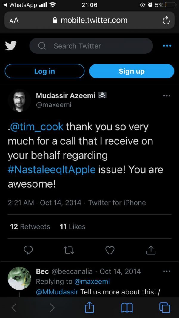
A week after he mailed his letter to Cook (he later posted it on Medium as well), Azeemi received a call from Apple representatives. “I honestly wasn’t expecting a reply,” he told me on a Zoom call. “But I’d read in Steve Job’s biography that the tradition of the Valley is that, if you ask, you’ll get an answer, so I thought I’d try.” He was so surprised by the call, he thought he was being served a cease-and-desist notice or, at the very least, about to be told off for repeatedly tagging Cook on Twitter.
Instead, Apple acknowledged his letter and lament, promising it was on the case. Three years later, a typeface called Noto Nastaliq became the default Urdu typeface on Apple devices. The resulting fanfare was reminiscent of how Ahmed Mirza Jamil and his 20,000 glyphs had been hailed 30 years earlier. “One day, when telling the story of how you’re able to write Ghalib and Bulleh Shah and Punjabi curses on your iPhones,” writer Ali Eteraz exulted on Facebook, “hope you’ll remember a guy named Mudassir.”
For a time, Urdu’s online existential crisis felt as if it had been averted. Zeerak Ahmed, a Pakistani software designer now based in Seattle, is more circumspect. Apple’s integration of the typeface, Ahmed noted in a blog post he wrote at the time, was either half-hearted or careless: words in nastaʿlīq would appear so small as to be nearly illegible on a screen or would exceed the bounds of text boxes. “Ironically,” he quipped, “the Urdu word for ‘complete’ fails to completely fit in Apple’s bubbles for text messages.”
The problem, he pointed out, was bigger than the availability of appropriate fonts: system interfaces, despite the advancements of Unicode, were still being built primarily for the Latin script. “We’re just at the point where we’re beginning to make sure our interfaces work throughout the world — that the moment you switch to a right-to-left language, things don’t break,” said Ahmed, who exudes a quiet, professorial air. This inability to scale nastaʿlīq to a system font might be why it still isn’t available as a system option on Android devices, which are far more popular than iPhones in Urdu-speaking countries.
Even if Urdu’s typeface problem is, in theory, resolved, the ghosts of old technologies continue to trip up developers in other ways as they scramble to keep up with new advances. “We don’t have the data needed to build artificial intelligence on top of existing technology: voice, handwriting recognition, dictionaries, autocorrect,” said Ahmed.
Existing Urdu datasets, according to Ahmed, are rife with errors. Glitchy nastaʿlīq typefaces mean publishers add or remove spaces for aesthetic reasons; the absence of spell-check software results in a proliferation of typos. From a machine-learning perspective, this spells disaster. “We simply took a bunch of Urdu digests and digitized them. It’s just blobs of text. You don’t know when it’s from, where it was published, who wrote it,” he lamented. “All Urdu software is broken because the underlying data is broken.”
Ahmed thinks a lot about the long-term effects of technological oversight. For the past several years, he has been working alongside scholars and researchers to build an Urdu dataset that can support modern machine learning. He has named it Maḵẖzan, or “repository.”
When you flip open an old Urdu textbook or newspaper, it is most likely to have been written in Noori Nastaliq. But you’ll also come across words in parentheses, written in English or in a conspicuously different script, probably naskh — a manifestation of the holes in Mirza Jamil’s 20,000-word bank of character combinations.
These might represent a figurative hole, too, Ahmed argues: the constraints in the typeface have stifled some forms of progress in Urdu-speaking society. “The one major discipline that has shown up in the world since the eighties is information technology, and that seems to be the one discipline that, coincidentally, doesn’t seem to have any technical vocabulary in Urdu.” Ahmed doesn’t think this is a coincidence. “There’s no way to prove it at a causation level, but I think it says a lot about what incomplete digitization does to the development of a language.”
Ahmed’s Maḵẖzan has sourced enough data to become the de facto starting point for any Urdu machine-learning application. Ahmed is aware of the responsibility that comes with this. He cites a recent study of predictive text and its influence on how people wrote restaurant reviews. “They had one group use a keyboard that made positive suggestions and another that made negative suggestions, by changing the underlying weights of the language model being used. That changed what people typed — the actual language people used changed as a result of what the technology was enabling.”
The expansion of the internet is precipitating a massive linguistic extinction.
“This scares me,” he continued. “Because it means, if I feed my system bad grammar, it’s going to suggest bad grammar, and people are going to write in bad grammar and that bad grammar is slowly going to be ingrained. If I take terminology and slowly ingrain it, it will become part of our vernacular.” He is particularly meticulous with the datasets added to Maḵẖzan and insists on keeping it open source. The proper preservation of Urdu, in his view, will require a careful curation of the materials used to power its autocorrect and autocomplete technologies, in order to avoid encoding unwanted bias. (He recognizes that, much like Urdu publishing, Maḵẖzan currently overrepresents works by men and texts from Lahore.)
The open source dataset is also in response to frustrating attempts at correcting proprietary datasets, especially for underrepresented languages, such as Urdu. It often becomes impossible to understand why language algorithms behave a certain way, what sort of language they are promulgating. “If you use Google Translate for Urdu and Hindi, words that should be the same end up being really different,” explained Ahmed. “We assume part of the reason is that the datasets they’re learning from are very different … but we have no way of double checking, because Google’s dataset is proprietary, so you can’t audit it.”
Urdu isn’t the only language facing an existential crisis when it comes to its digital future. In his 2013 study, mathematical linguist András Kornai found that, of the more than 7,000 languages used around the world — 2,500 of which are considered endangered — less than 5% were becoming fully functioning languages in the online realm. The expansion of the internet, in other words, is precipitating a massive linguistic extinction.
For Urdu speakers to feel fully at home on the internet, work may be required on multiple fronts: on making sure veteran practitioners like Nasrullah Mehr are included in the conversation; on wriggling out, as Ahmed is attempting, from under the shadow cast by Latin-centric tech; on putting popular pressure on major tech platforms, as championed by Azeemi. Much of this is quiet, steady work. As new generations of Urdu speakers come of age, most may not even be aware of the ways in which technology has shaped — and continues to shape — their tongue.
“I don’t think it’s an eventuality that all languages will one day be represented fully digitally,” said Ahmed. “It’s totally plausible we get to a point where it makes more sense to shift the culture than to shift the underlying tech.” Last year, scientists changed the official guidelines for naming genes because Microsoft Excel kept misreading them as dates. In other words, scientific tradition buckled before computer formatting. “The same thing,” Ahmed warned, “could happen culturally.”