When we emerge from our Covid-19 lockdown will we still listen to the scientists, the statistics and the stories of the past? Will we listen to the lines? An essay by Paul Ward.
Nearly 15 years ago, as part of research for a sci-fi film script I got in touch with epidemiologist Dr Michael Baker. I wanted to know what the scenarios might be if New Zealand faced a pandemic. The logistics were mind-boggling, involving mercy flights, lockdowns and totalitarian curbs on personal freedom.
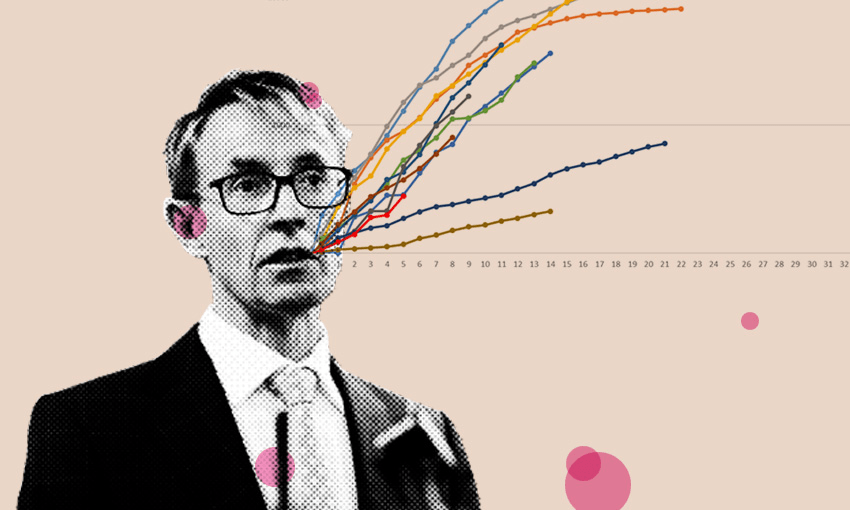
Science fiction is suddenly science fact. Hypothetical models are being played out in real time. Our feeds are filled with graphs and curves. Statistical concepts we last had to comprehend at school are headlines and tweets. This time the consequences aren’t exam passes, but how many die? What point on the curve is NZ compared to Italy at the same stage? How do we bend it?
Statistics are a part of everyday life – polls, charts, stocks, sports league tables, GDP, house prices, unemployment. But suddenly we are statistics: 40 days and 40 nights of living out our contribution to a line on a graph.
The high reaches of the Y axis correlate with dead Chinese, Italians and New Yorkers, illustrated with portentous imagery (morgues, PPE, ICUs). Early on, origin stories of animal transmission (a bat sneezed on a pangolin?!) kept the implications of the maths at an exotic distance, even as the near-overnight construction of entire hospitals hinted at the magnitude of the virus.
In hospitals elsewhere, the most profound triage decisions have been forced on doctors as the supply of beds and respirators fails to meet the needs of infected patients. In Aotearoa, our society has been completely reorganised in an effort to shorten the odds against the greatest threat to public health in our lifetimes. As country music great and statistician Kenny Rogers (RIP) put it, you’ve got to know when to roll.
For those of us who came of age in the 90s and 00s this is reality biting hard. Theories like Francis Fukuyama’s “The End of History” assumed we had it sussed and the worst thing to happen geopolitically in our (white, western) bubbles was the US president having an affair, or whether Rachael and Ross would get together on Friends. 9/11 and the GFC put more pressure on, but we travelled freely on our OEs and brought children into a world of relative security. Climate Change lurked but that particular dingo felt a long way from the campsite.
Understandably, few are disputing the call to lockdown to battle coronavirus, as coffins and stricken politicians make stark the implications of exponential growth. With humans as the vector, Covid-19 – from an animal market to the entire globe in three months – is globalisation’s hospital pass.
And yet the scale of devastation promised by climate change massively dwarfs Covid-19. We’ve seen the graphs for decades now: Earth Inc is “hitting all our targets to date”. Ditto inequality. Ditto mass extinctions.
There are death tolls we’ve closed our eyes to. Slower, but no less shocking. Insect populations have collapsed. Since 1970 it is conservatively estimated half of earth’s (known) insects have been lost as a result of pesticide use and nature loss. Since 1950 the population of birds in the US has dropped by 3 billion. The sequel to The Birds is half the birds, and that’s surely more horrifying. In New Zealand, Forest & Bird press releases tell us of biodiversity crises, with our native wildlife leading the “per capita” medal table no one wants to top: “threatened with extinction”. Life on earth is radically being altered.
Kiwi are our icon, a taonga. Yet the animal itself is seriously threatened, declining at 2% per annum. Two percent doesn’t sound like much, but do the maths – we’re all experts on rate of change now, right? It means extinction within generations without bold and ambitious action.
Frustratingly, repeatedly stating stats like these numbs their scale and creates impotence. Fact-citing heralds like Greta Thunberg are mocked as emo Chicken Lickens. The speed and impact of Covid-19 simply hasn’t given us the breathing space to turn away.
When we emerge, will we listen to the scientists? How will we respond to the terror of statistics elsewhere in our world? Will we be alert to the signs in the entrails, to the graph curves that tell the same story as Covid-19, just at different rates of change?
“Kua ngaro i te ngaro o te moa”
Lost as the moa was lost
Will we listen to the old stories? There have been earlier paradigm-shifting confrontations with statistics in Aotearoa. When people first arrived here it was a protein paradise: seals and sea-lions on every beach and moa, from Big M to kids size, running around the motu as takeaways. But then, as suddenly as we are on house arrest, moa was no more, eaten to extinction
The rate of decline of what was left (kākā, kererū) meant that unless that food resource was managed more sustainably there’d be no more to eat. Concepts of kaitiakitanga (“guardianship”), rāhui (“to put in place a temporary prohibition, closed season”) protected these taonga. Some are calling the lockdown a rāhui.
Pākehā have no reason for smugness: the pace of loss in the last two centuries under the Crown far outstrips what went before. In our bubbles many Kiwis will be dreaming of swimming and fishing, but probably not of campylobacter (if you jump in a stream), or a moana without snapper and crayfish (if you dive in the Hauraki Gulf). Nineteenth Century habitat transformation of New Zealand’s lowland ngahere, awa and wetlands – ngā uruora – matched any forest destruction taking place now in Indonesia and the Amazon, and the pests we’ve brought with us threaten even the adaptable wildlife survivors. We’ve been (justifiably) proud of our capability as extractors, delivering kai to sustain ourselves here for over 700 years. But have we been keeping up with the rent?
Because if we don’t pay a fair price for the feed, we’re collectively sawing off the branch we are sitting on, while cheerfully reading Jared Diamond’s Collapse. (Of course Diamond’s investigation into why civilisations collapse referred to other civilisations: to the Aztecs and Easter Islanders … not us.) Philosopher Thomas Kuhn proposed that it’s not possible to recognise one’s paradigm, or system of knowledge, until that paradigm shifts. He used the Rabbit-Duck optical illusion to illustrate how the same information could be seen in radically different ways. Has Covid-19 shown us the duck?

Covid-19 is a great human tragedy; the scale of death may render these words luxurious. If so, aue.
When we come out of our houses, into the world again, will we listen to the lines? Will we embrace a 21st Century edition of kaitiakitanga? Can we stamp out the curve for planet Earth before Papatūānuku’s ICU department is overwhelmed?
What graph lines embody our values, our “manawa” (“heart”, “breath” – a word for the times) that we should respond with such urgency. If we were confronted with graphs from events when we had the chance to shift them, how would we act? In the 1918 Spanish Flu pandemic the New Zealand administration in Samoa allowed ashore sick passengers from the SS Talune. About 8,500 people died, nearly one quarter of Samoa’s population. Look it up. How do we feel that 2,500 of the 9,000 people who perished in New Zealand during the same pandemic were Māori? Proportionally eight times as many Māori died as Pākehā. Roughly as many New Zealand soldiers died at Gallipoli. If there were still huia in the Tararua or Hunua ranges, and we knew where the line was trending, what would we do to protect them? (A century and a bit ago, “smooth the pillow of a dying race” was Sir Walter Buller’s repugnant take on the stats with regard to the government’s duty of care towards Tangata Whenua. Be thankful for Be Kind!)
What of the pie charts that show present inequalities? When nurses, care workers and food providers asked for a fair go, for koha, and calls from doctors decried that our public health system was underfunded, were you listening? What will the curve say about the taxes Facebook, Google, Netflix and Amazon don’t pay? Amazon CEO Jeff Bezos just cashed in S3.4 billion of shares but there still aren’t enough ventilators in the US.
Risk of death from human contact has forced us into bubbles. Outside those bubble windows, the pause of people has meant that billions of city residents can see the sky without pollution for the first time.
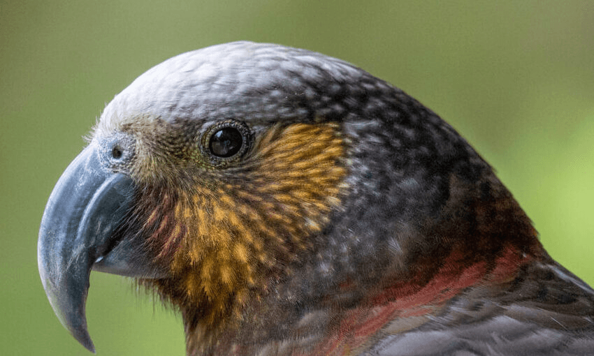
Yesterday, on an early morning run through Mt Victoria’s pines, the orchestra of tūī, without the traffic noise to compete with, sung up the sun over the city. A kākā parrot hooned down the path and squawked over my head, ignoring the two-metre rule. Kākā plumage is a dull rufous brown, but under their wings is a flash of scarlet and orange. As it skidded around the bend, the orange caught the sun.
Kākā have made an exponential comeback in Wellington skies after a century’s absence, thanks to Zealandia Ecosanctuary and community and council pest control efforts. The urban flock is now one of the parrot’s largest wild populations, helping remove it from the “at risk” species list.
The fly-by was an untethered salute to a world beyond the rāhui. When we emerge into a new dawn, there will be a drive to pick up where we left off. But we will have a chance to reset ourselves. Surely, business as usual can’t continue. What is an essential service? What’s the promise of the sun under that kākā’s wings if we are bold enough again to confront the truth of the statistics?