
April 12, 2020 Update

Dear All,
Here is today’s update.
Have we flattened the curve in New York?
It appears so. Emergency room visits and hospital admissions seem to have decreased for several days. This is welcomed relief given the capacity issues we were facing in the city. As we discussed in the last blog, NYU Langone Health converted its entire hospital to treating COVID. Per NYU’s website, we’re a 450 bed hospital. At our peak, we had more than 450 COVID positive patients in the hospital. We did this by re-opening dormant wings of the hospital and converting operating recover rooms and recovery rooms to accommodate additional patients. Suffice to say, we were stretched. Fortunately our hospital, like others in the state, started seeing decreases in new patients arriving and have flattened the total number of patients in the hospital. If we’d had another week of new patients like the week before, there’s no question we’d have run out of beds and ventilators.
This chart shows the change in hospitalized patients per day for the state of NY and shows how we’ve been steadily declining over the past week:
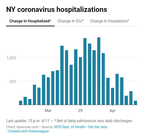
Changes in hospitalizations is a good leading indicator of where your community is heading whereas deaths will be a lagging indicator and trail hospitalization numbers in seeing them decline. We’ll discuss this further below.
How did we flatten the curve in New York?
Lockdowns and social distancing. Since we still have no reliable treatments, the only way to lower the number of new admissions is to slow disease transmission through distancing and lockdowns. New York state went into lockdown around March 22nd and you can see from the chart above it took ~7-10 days after that intervention to see the peak in hospitalizations before downtrending. This may be helpful to other communities in understanding when to see the effect of locking down in the future.
If we had not locked down, it is almost certain the graph above would have continued increasing at a steady (and perhaps faster) rate. Given almost every hospital had no remaining capacity, a steady increase in volume would’ve been catastrophic.
Below are some pictures that show how locked down the city was.
This is a picture of Park Avenue at 9am on a Tuesday morning when this street would typically have bumper-to-bumper traffic and pedestrians lining the sidewalk.

And this is 5th Avenue in the middle of the day completely devoid of activity.

Strange times to say the least, but as you saw on the graph above, doing their job in helping bend the curve.
What about death rates?
While it’s encouraging that hospitalizations are down, it is too early to calculate or predict the ultimate mortality rate from COVID. Deaths will be a lagging indicator that will keep rising even after hospitalizations fall. Below is the daily death toll for NY run at the same time as the hospitalization chart above:
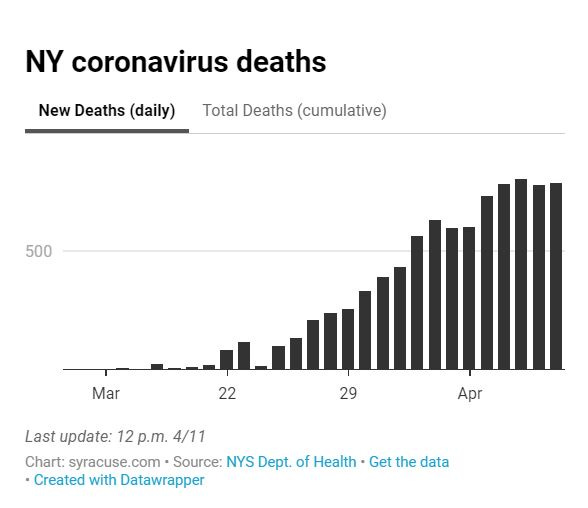
As you can see, it is too early to know whether deaths have peaked. The death peak will lag significantly behind the new hospitalization peak by, at minimum, a week. Hopefully others can learn from New York’s trends to predict where their community is headed and how to estimate when you’ll start seeing trajectory changes based on actions such as locking down.
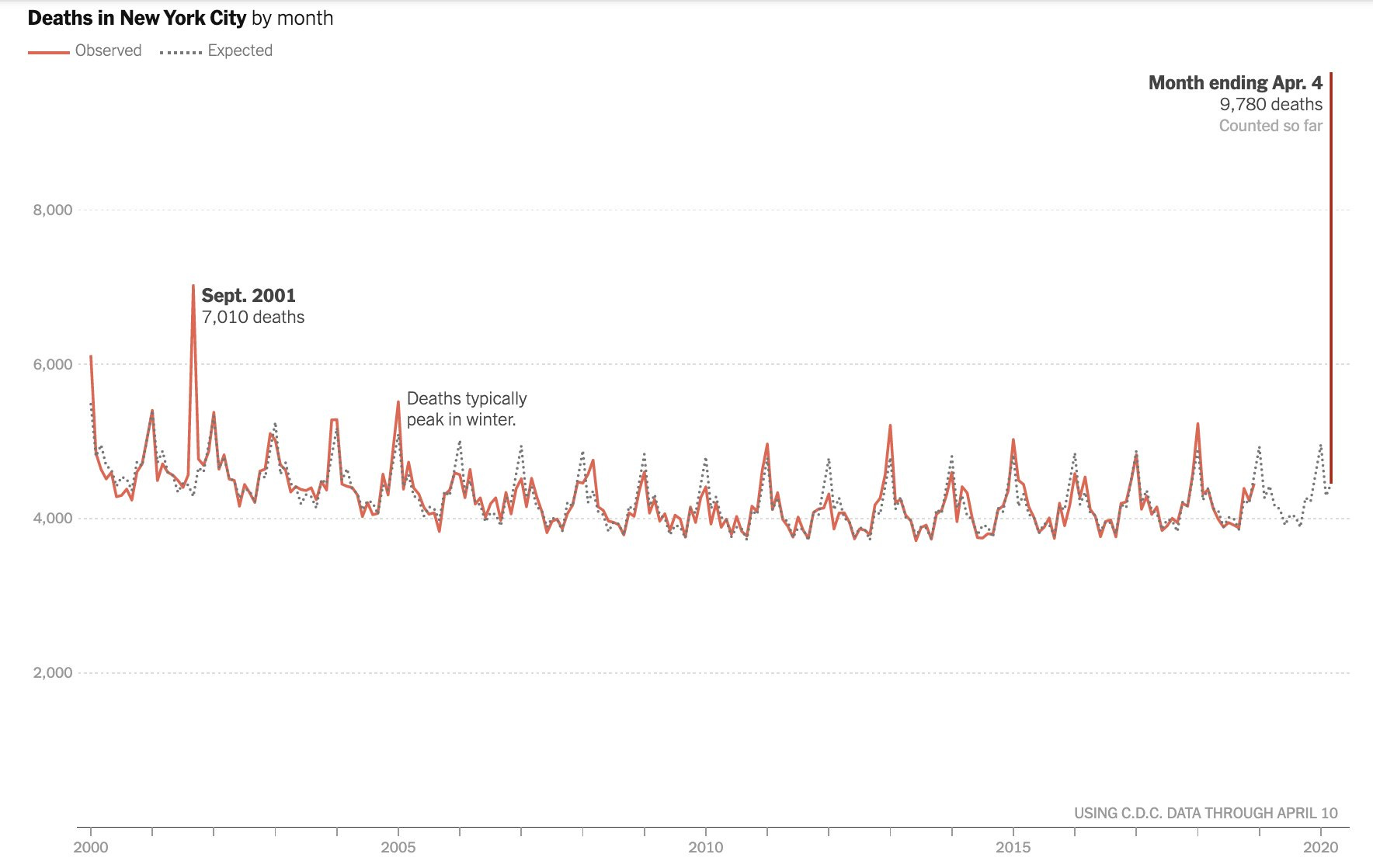
Speaking of deaths, below is the average number of deaths per month in New York City over the past 20 years. You’ll note the usual number of deaths per month averages 4,000-5,500 while this past month was nearly double that at 9,780.
Many of these folks died at the hospital. Thus, the one thing that every hospital ran out of was morgue space for dead bodies. Today’s hospital care is pretty good and we’re not used to seeing large numbers of people dying every day in the hospital like we’re seeing with COVID. With the surge in number of daily deaths, almost every hospital has run out of space for dead bodies. The solution has been parking refrigerator trucks outside the hospital to store additional bodies. See below of trucks that are parked outside almost every hospital in the city:
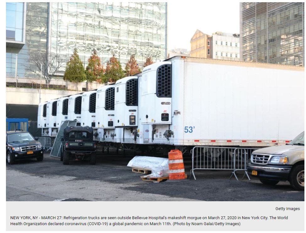
I don’t know of a single hospital that hasn’t had to turn to refrigerator trucks to handle the additional volume.
At a national level, the number of COVID deaths per day is now the #1 killer in America as of April 8.
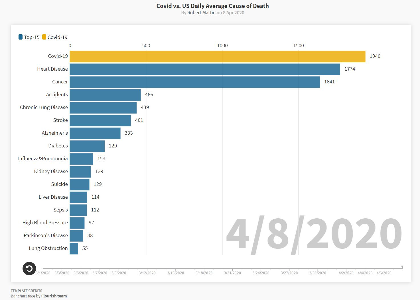
You can click here to watch how COVID started at the bottom of this graph on 3/2/2020 and steadily climbed day by day until now where it’s #1. Since death is a lagging indicator as discussed above, I don’t anticipate this changing imminently.
To recap, it seems we’re past the peak for new hospitalizations in New York but are still waiting for the daily death count to decrease.
Later this week, I’ll give an update on testing and what I’m hearing on re-opening New York City.
Thanks and be safe,
Harry
Click here to subscribe to future updates if you have not already.